Monday, 2 December 2013

Making clear sense out of Minimalism

It is interesting how my fellow designers are using Minimalism unconsciously in various fields of design. Even when created in the conscious sense the design can be enormously effective resulting from the way the elements have been used.


The name of this minimal graphic design poster is based on the FridaKahlo, she is the lady who composed the idea behind this artwork. This art has some cultural effects and some genetic indications in it as well. In Frida two artists Joy and Frida explore incredible emotional conditions in it and create an environment that influenced with the help of their artwork.

For a person that knows the Movie FRIDA they would know and recognize what associates this poster with the movie which is the mail character, as her facial features are shows and they are. 

Kahlo's life began and ended in Mexico City, in her home known as the Blue House. She gave her birth date as July 7, 1910, but her birth certificate shows July 6, 1907. Kahlo had allegedly wanted the year of her birth to coincide with the year of the beginning of theMexican revolution so that her life would begin with the birth of modern Mexico. Her work has been celebrated in Mexico as emblematic of national and indigenous tradition, and by feminists for its uncompromising depiction of the female experience and form (wikipidia-maxoco portal)

PEACE.Sibusiso Lukhele.Digital Image.2012
This image was taken by my fellow student Sibusiso Lukhele he posted it on 75 a photography site were photographers post their work to and the photos are reviewed by other photographers, he did not mention anything about Minimalism within the the evaluation of the photo, even when i asked him about the thought behind it he never said it was a Minimalism based photo with so much Minimalism elements evident. The image poses a peaceful weather and atmosphere and one can conclude is a peaceful image because of the three pigeon.
what do you think? 

DISCUSSION WITH FELLOW DESIGNERS

I had a discussion with two of my fellow designers, and we were discussing a the kind of logo that will best serve the purpose of the Organization I am coming up with as a solution for the design problem I found for my research document. This was a weakness of my situation analysis, for professional sdesigners to suggest I just create a dot and say I'm doing minimalist, a dot without a meaning. Our job as creative is to create a meaning for each little line or dot that appears in our designs and Minimalism does not only appear in a dot, dash, line, geometric shape etc. It can appear in a wide range of design field depending on what u are designing for, I would like to make an example on editorial, it seems very complex and yet fixed but M (online) applied minimalism in editorial.

Sunday, 1 December 2013

I analyzed milk packaging that seem to be dominating the design industry and I realized they all appear in a minimalist way, the all have used a lot of white space and bold fonts. These products are the same just different brands, surely there must be a reason why brands that produce milk often use minimalist packaging.

In my own understanding, it is simply because the milk it self, milk is very pure and white so for the brands to bring association to the brand packaging and the product they chose to go with minimalism, clean negetive space.


http://www.pinterest.com/packagingdiva/1001-ways-to-package-milk/

http://www.nenadivanovic.com/63824/484830/portfolio/minimal-milk-and-yogurt-package

From Art to Design

While I was writing a literature review for my thesis I found out some interesting facts about Minimalism as an art movement transforming into a design trend. Historically Minimalism started an art movement that was influence by
  •         The De Stijl art movement
  •     Architects like Van Der Rohe
  •     Traditional Japanese design

De Stijl was a one of the modern art movements that dominate in the twentieth century. The Importance factors of this movement are the fact that art was being used to design architecture and furniture. After World War I artists, architectures, designers and writers desired alteration from old forms and philosophy.
Ludwig Mies van der Rohe was a German architect who is considered a pioneer of modern architecture, and his architectural style during post-World War I set a foundation for minimalist design. He has designed many landmark buildings, including Chicago’s Crown Hall and New York’s Seagram Building.
The traditional Japanes Design focused on adding only what is significant and removing the other things, the space are always maximized and with wooden structures.

The official introduction of Minimalism was during an exhibition in St Patersburg through the work of Kazimir Malevich, a Russian painter and art theoretician born 23 February 1879. He was a pioneer of geometric abstract art and the originator of the Avant-garde, Suprematist movement,  he placed a Black Square on a white background claiming that art no longer served the state or religion. He laid the foundations for a secular art that was detached from utilitarian purposes and removed from the ideological function of representation. (Concept of Modern Art : Suzi Gablik p. 245)

This work was the one he was well known for also one of the most famous paintings in Russian art, this art piece is regarded a minimalist work simply because of the use of subjects and within it, it consists of one shape; square, two colors; black and white and one dominant point of emphasis, where the painting is presenting only one subject matter.


KAZIMIR MALEVICH.Black Square.Oil on linen.1915

Black Square marked the turning point of the Russian avant-garde movement. Before creating this painting, Malevich spent eighteen months in his studio, labouring over thirty non-objective paintings. In the end, he had created a series of non-objective paintings, of which Black Square is one. His invention of the word “suprematism” was meant to refer to the supremacy of the new geometric forms. Although the other works in this period were created with visual brushstrokes and asymmetrical forms, Black Square was the prominent piece, with no visual textures and a perfectly symmetrical shape, as it was the paramount of Malevich’s change to pure geometric abstraction: suprematism.

Also as an influence of Minimalism the international style is an architectural style that developed in Europe in the nineteen twenties and nineteen thirties, it dominated western architecture in the twentieth century. This term was first used by an American architecture born in 1903 Henry-Russell Hitchcock in his essay “The International Style: Architecture Since 1922.” The Bauhaus Institution was the first to utilize the style as their way of moving from art to design they familiarized the incorporation of engineering and art as engineering student were suppose to study art course. The main principles of the Bauhaus School were unity, combining colours, form and space, these members of the Bauhaus rejected the arts and crafts moment emphasizing on luxurious objects created by individuals.

The Bauhaus is often associated with a severe but elegant geometric style carried out with great economy of means, though in fact the works produced by its members were richly diverse. (Britannica Concise- Encyclopedia.Bauhaus.2013)


HERBERT BEYER.Universal Typeface 1952                                
This typeface consists of reduction of letterforms to their bare essential.  Hes removed uppercase letters and serifs, as his main focus he attempted to modernize typography in the simplest manner.


BAUHAUS ADVERTISING.1920
And this is how Minimalism went from being an art movement to s design trend.

Editorial Minimalism

Minimalism in Editorial requires creative thinking in all aspects that go in to the magazine, namely Photography and Typography.In photography Minimalist images are effective simply because they will have a single subject matter then it is easier to recognize what you as the viewer are looking at and what the story behind the image is. M Magazine is a fictional primary source of minimalist inspirations in different forms of art and design categories. It covers the latest and the best minimal inspirations, trends, news, and resources around the world from different artists and designers. It is a monthly published, trade magazine that specifically aim for creative professionals from occupations like architecture, art, fashion, photography, and graphic design.


This assignment is about conceptualizing a new magazine, and my goal is to reflect the concept of minimalism through the design, simple photography, and simplified advertisements of the whole magazine. Through this project and my instructor Marc English's guidance, I've learned more that minimalism doesn't have to be lazy, monotonous, and boring. It could be complex, meaningful, and crafted, but still reflects simplicity and emphasizing on the core essence of communication. (Deric Ferrer-Behance 2013)


Because minimalist design is reduced to only its most essential visual elements. As a result, typography is key to capturing the user’s attention.
The choice and usage of typefaces in minimal design is critical to creating a unique look and feel that makes a lasting impression on visitors. Therefore, it’s important to choose a combination of typefaces that both reflect the personality of the brand and provide a clean, pleasurable user experience. Yet again, restraint is key, as using too many different fonts can make the site feel unorganized and chaotic.
Beyond the choice of typeface, attention to detail in size, color, spacing and weight is important to ensuring readability and defining the overall aesthetic of the site.

Wednesday, 30 October 2013

The value of Minimalism and Design

I read through one of my fellow student's (Ditiro Tupaemang) thesis, he speaks about the value of design. He discusses how people who have access to design programs get comfortable in the idea that they are designers only because they can operate the system. They have no design training or whatsoever the only thing they know how to do is getting pictures together without concepts and meaning.

Even work that has been done by individuals that are not creative people or did not study creative they utilize minimalism in a poor manner because design is about concepts abstraction, starting of with representational to non-representational work. This jeopardizes the essence of Design in all the basic senses because this self taught look at the simplest image the can lay on a back ground with no knowledge of the elements and principles of design, the final work may appear minimal but yet the lack of these principle establishes an idea or a conclusion in other people's minds that minimalist design don't have a meaning, which is untrue no matter how minimalistic visuals may be the professional creative people create this type of work to bring a special meaning and that is why they follow the elements and principles, they also give themselves time to work from very strong and meaningful concepts.

I agree with his topic in the sense that, this people who are not designers they leave no meaning to minimalism because then their work has no concept and therefore it has no firm meaning and the audience are deprived of the opportunity to understand, if a message is not clearly thought through for it to have visual effect then it is pointless to have the message displayed to the public. 
Ditiro's paper brings strong enthusiasm to minimal work out there, whether they have gone through principle of design or not. I say this are the kind of people who leave no value to Minimalism do you agree?


Thursday, 24 October 2013

Communicating in Signs, Symbols, Icons through simple Designs

Taking cues from street signs and other simple graphic systems that rely on basic shapes, designers are working with silhouette-like patterns and stark black-and-white palettes, playing with positive and negative space with striking consequences. This very basic elements are not only forms the basis of learning to draw; they are also the solid foundation of the most incredible prints, patterns and sequences used by a vast number of artists and designers in a wide variety of design fields worldwide.
These signs also assist in the communicating with the public; the simpler it is the easier it is to understand. The size of in which these signs are presented in matter as a results of visibility (how visible they are for the public to recognize immediately). Whether is to inform, instruct or announce the sign as a significant tool of the public it should always have an effect.


Icons are an effective aid in helping users quickly find and gather information. They not only communicate information but help break it up and add visual interest to grab the users' attention in all the simple aspects. With thousands of icons available, with endless gradients, geometric shapes, colors and reflections, it can be overwhelming as to what will best suit your minimalist design. Yet geometric shapes can present the simplest icons with just a small amount of gradient that’s easy on the eye however easy to detect.


Symbols for us in the design world, is usually a combination of graphic elements that represent something to us and the public, in other words a picture that tells a story. Symbols can be Logos (visual images of brands and companies). The association people make via the symbols is crucial in how they eventually classify their brands and thus, chose to interact or not interact with the brands out there, it is of great significant to represent a brand in a appealing manner, a manner in which your symbolic image bring about trust to your brand.


Wednesday, 23 October 2013

Small Businesses need to stand out

“Less is more” is probably the most well-known catch phrase of the minimalist movement. It was popularized by architect Ludwig Mies van der Rohe in describing the minimalist aesthetic.

It doesn’t matter what type of print, digital or web communications you are creating for your small business, less really is more when you want your message to stand out. More important than making things look visually appealing, a graphic designer’s main job is to convey their client’s message in any communications. In our world of information overload, you have only a few seconds to catch someone’s attention. If a potential customer has to work too hard to determine what you are trying to tell them, they will move on. Trying to cram too much into your home page, or including way more than anyone would ever care about in your brochure is not doing you any favors.

The first word you need to keep in mind is hierarchy. The content of your communications should have a distinct visual hierarchy. You can achieve this in several ways. Content at the top of a page is always read first, and the bottom of the page is generally used for less important information. You can also use font size to increase or decrease the importance of information. Headlines should be larger, and possibly even in a different font, to make them stand out. If all the copy is the same size and weight, it’s difficult to discern the message. You can also use color to create categories for content to help differentiate them.

The second word is editing. If you are writing your own content for your communications, being able to edit aggressively is key. You want to clearly convey your message in as few words as possible. Too much content on the page is overwhelming, and your audience won’t read any of it. If editing isn’t your strong point, ask a colleague or trusted friend to read it for you and offer suggestions.

The final word is simplicity. Overly busy pages are difficult to read, and it’s hard to determine the message. Keep the number of messages you are trying to convey per page to one main message, and no more than two or three secondary messages. Any more than that, and they start to get lost. You should limit your design to no more than two fonts. Too many colors can be distracting as well. Unless you are using color to differentiate categories of information, two to three colors is sufficient.

Keeping these three words in mind, hierarchy, editing and simplicity will go a long way in helping your small business make your message stand out.


Minimalism's Existance

The most exciting factor about Minimalism is that it keeps making its way within a design when the authentic design is not categorically designed for the trend, In my understanding i can simply say designers make use of this trend's principles without consciously doing so.

How one's design ends up being minimalist, You may find that in beginning any design, the designer clearly layout what it is they want to accomplish within the design. They can include whatever content necessary then cut what's necessary down to what's really necessary, it's always less than you originally think. Of course, a design can start by including as little as possible, but it's much easier to get to the absolute core of the content by seeing its entirety first. White or blank space will naturally evolve when content is eliminated. The whole idea behind this negative space is to put more attention on the content that the designer deemed absolutely essential to include. By isolating content, the designer ensures that the viewer's attention is drawn to it. That's the beauty of simplicity: less is more.

Any detail that's off will and can stand out like a sore thumb when the owner looks at it. It's these little things that turn an average design into a great design of minimal content yet the designer's intentions were not based on that but just a great design, this I what makes the trend survive within design, what do you think?

Generative Art

The rise and rise of generative art, particularly tools such as Processing – has spread to typography, with new abstract letterforms being created in an organic (yet still utterly digital) way. Although manipulating the code can control various factors, the randomness of the final output can also have a similarly raw, unique appeal to handcrafted work. New York-based typographic illustrator and designer Craig Ward has produced various generative art experiments, with often-unexpected results. Examples of Generative Art come from throughout art history, from the structured geometric tiling of Islamic Art to Minimalist artists who constructed works based on number systems and formal rules.

“The Bulk is a hypothetical higher dimensional space within which the eleven dimensions of our universe may exist.” It is also the title of Craig Ward’s ongoing project attempting to typographically interpret some of the abstract ideas, terminology and concepts in modern theoretical physics, quantum mechanics and cosmology.

In Minimalism these geometric shapes characterized the elemental or “bare bones” forms of art, which according to critics, represented the result of modern art's progression toward the most simplified form of abstract art possible, which then also helps build generative art from its most basic principles. The various implementations of these “generative” processes capitulate a range of results, from works that are strictly ordered to those that rely largely on elements of chance and randomization.

Generative art refers to art that in whole or in part has been created with the use of an autonomous system. An autonomous system in this context is generally one that is non-human and can independently determine features of an artwork that would otherwise require decisions made directly by the artist. In some cases the human creator may claim that the generative system represents their own artistic idea, and in others that the system takes on the role of the creator.

"Generative Art" is often used to refer to computer generated artwork that is algorithmically determined. But generative art can also be made using systems of chemistry, biology, mechanics and robotics, smart materials, manual randomization, mathematics, data mapping, symmetry, tiling, and more. Wikipedia


Friday, 18 October 2013

What makes a good design

Having gone through various Graphic Design blogs i realized there are ways and method that designer need to stay true at and follow as a tradition of Graphic Design. This are basic strategies of becoming a good designer.
Peter Vucovic says this are the 12 ways of becoming a better designer. 

1. Learn to use the grid
2. Use technology to make better font choices
3. Explore different palettes with free color generators
4. Design to tell a story
5. Use pen and paper while brainstorming
6. Never settle for one idea
7. Use RIS approach to drive your design decisions
8. Make a cover version of a popular design
9. Decorate your office – intelligently
10. Research more
 11. Learn to draw
12. Learn to (copy) write


What makes for good graphic design? You’ve probably formed your own opinions on the subject as you’ve looked through countless books, magazines, posters, and signage. And chances are you’ve also begun to recognize certain patterns: diagonal lines lend a certain dynamism to a page, typography can be readable or illegible, a layout can honor or obliterate white space. But how did graphic design develop into what it is today? Fortunately, there are people like Steven Heller to pinpoint the big-bang ideas that led to the standards we take for granted. In 100 Ideas That Changed Graphic Design (Laurence King), he and Véronique Vienne identify, define, and illustrate the breakthrough moments that continue to inform contemporary visual conventions.
When the authors began to compile their list, they made sure to focus on the big-bang ideas rather than “tropes or conceits--as in stylistic manifestations rather than substantive design foundations.” They also avoided the urge to catalog overarching movements: “Under the ‘great historical isms, there can be numerous big ideas, such as asymmetric or discordant typography or vibrating color . . . Rather than skim the surface using the shorthand of isms, this book unpacks those art historical categories and pulls out the individual big ideas within them.”

Nor do Heller and Vienne claim to have covered every important notion, good or bad, of graphic design: “We determined more ‘aha’ moments exist than these. Yet 100 is a nice round number.” Here are nine of our favorites, excerpted and adapted from the book. BELINDA LANKS

Feminine Elegance

Continuing the trend for clean, simple design that’s free from fussy embellishments, this particular aesthetic brings an elegant, feminine touch to the table. Combining subtle textures with soft, pastel colour palettes, the resulting design work exudes quiet confidence without the need to shout. Bold photography is juxtaposed with blocks of dusky pink, pale aqua and pigeon grey for a feeling of calm, often combined with Didot-inspired fonts for that extra touch of sophistication. I say Clean design for Females requires this kind of elements to have the completely compliment woman.


Didone typefaces (also referred to as Neoclassical and Modern) enjoyed great popularity from the late 18th through the 19th centuries. They are characterized by extreme weight contrast between thick and thins, vertical stress, and serifs with little or no bracketing. 


http://designspiration.net/image/2494477673198/
http://www.fonts.com/content/learning/fontology/level-1/type-families/didone

Designing with Basic Shapes

Minimalism in  some parts is characterized by simple, strong, graphic patterns that chime with the Bauhaus aesthetic: it’s all about straight edges, angular shapes and bold colours. Triangles, circles and hexagons replace more ornate patterns for a real sense of clarity, purity and authority – enhanced by widespread use of saturated primary colours. In some cases, shapes are also layered into abstract typography in a style that blends classic Bauhaus Modernism with 1980's graphic design.

Bauhaus was one of the first proper design schools, and while its instruction was deeply devoted to functionality, it was among the first to set out and prove that functional need not be boring.
The school steadily progressed under founder Walter Groupius, who, in 1923, saw what Russian and Dutch designers were doing and re-envisioned the Bauhaus' original mission of uniting and craft, altering it to unite art and technology. Good design that could be mass-produced and made available to the general public.

It was then that many of the Bauhaus' most iconic and lasting designs emerged. Centered around clean geometric forms, balanced visual composition, and materials such as wood, metal and glass, Bauhaus design embraced a futuristic look that was still very much interested in the creation of functional products for the real world. Encouraging a scientific approach to design, the mechanical and industrial aspects were not things to be covered up, but rather showcased.


The Bauhaus was founded in 1919 in the city of Weimar by German architect Walter Gropius (1883–1969). Its core objective was a radical concept: to re-imagine the material world to reflect the unity of all the arts. Gropius explained this vision for a union of art and design in the Proclamation of the Bauhaus (1919), which described a utopian craft guild combining architecture, sculpture, and painting into a single creative expression. Gropius developed a craft-based curriculum that would turn out artisans and designers capable of creating useful and beautiful objects appropriate to this new system of living.  
Independent Scholar

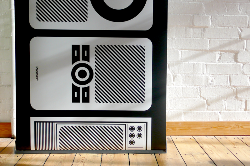
Promax Beyond

This is one partcular Design that complements the Bauhaus Asthetics and presents elemnts of Minimalism. 


Promax wanted the conference and awards to reflect the way in which those in branding, advertising, marketing and promotion are being asked to work beyond their normal comfort zones. The broad theme of the brief was Beyond the Box. Early on we decided to simplify the title to 'Beyond'.

Inspired by Duane Dalton

After looking through Duane Dalton website i was inspired by his portfolio, most of his work is minimal and clean, for example the work he did for
Gallant Visuls : "is small film production company based in Los Angeles, California. It is the creation of Brent Henderson and Eric Hill. The logo incorporates the act of looking by using a stylised eye. The pupil replicates a camera viewfinder.

He uses very basic geometric shapes yet they appear so alluring and convincing

The layering chequered pattern is influenced by elegant and stylish fashion wear and is a play on the word gallant. These components can be used separate or together in order to communicate Gallant Visuals across a range of materials".  Duane Dalton  


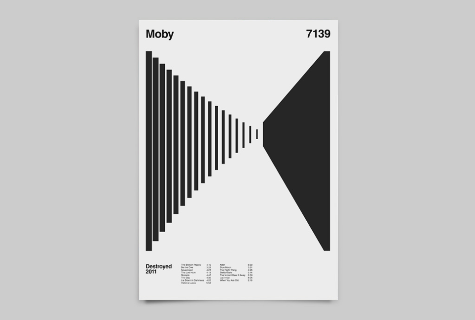
Moby Album Anatomy by Duane Dalton

Reacting against a modern-day existence in which we’re overloaded with information, data and constant updates about the world around us, this trend for refined, ultra-simplified design boils communication down to its bare bones, stripping out unnecessary fuss and complications to leave graphic artwork in its purest form. It takes confidence and skill to design in this pared-back way – there’s nothing to hide behind – and the few elements need to work extra hard.

The Moby Album breaks down album imagery into its purist form by discarding any unnecessary information. This is achieved using a strict grid that displays the relevant album details, which leaves a central void to convey a response to the album.

This void is filled by my personal response to an album. It can be influenced by the cover art, a key track or the overall flavour of the album. The chosen albums have had an influential and personal impact on me. It is music I listen to over and over again or more excitingly rediscover.
I only included a few images to show what is created in the Moby Album Anatomy.


Duane Dalton is a graphic designer and artist from Dublin, Ireland. He studied at The Institute of Art, Design and Technology, Dun Laoghaire, Dublin. Dalton holds a BA (Hons) in Visual Communications as well as a BA (Hons) in Fine Art.
He currently lives and works in London.


Anagrama's Work

All thi s work was create by anagrama, this work is relate to my previous post on Designing to stand out.


http://www.anagrama.com